So you've created the perfect campaign to promote your new product or service. Your ads, emails, and other traffic drivers are in place, your sales team is locked and loaded, and you're ready to push 'GO.'
The only thing that stands between your team and a batch of new prospects is your landing page. While it may seem simple in nature, a landing page can mean the difference between hitting the campaign out of the park or getting stuck on the bases.
Do you want to spend all of your time and resources driving traffic to a landing page only to have your leads drop right out of the funnel? No! Luckily, we have a handful of quick improvements guaranteed to get those conversions rolling in!
Check out our top 6 below:
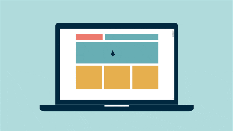
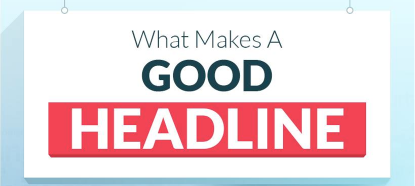
1. Use Strong Headlines and Copy
Landing pages should be simple by design. Every word counts. Tighten the copy by eliminating unnecessary words (such as adverbs). Match the headline and copy in tone and style. Use your A-game grammar skills to leave no room for misunderstandings. Formstack suggests that trust indicators, such as ratings and testimonials, be included in the copy.
Be honest with yourself when writing the landing page. If it doesn't make sense to you, your leads will not understand the information given. Visitors should know at a glance what the page is about and what they’ll get in exchange for entering their information. Try a five second usability test to measure first impressions before you even launch!
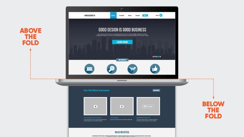
2. Keep the Most Important Information "Above the Fold"
Sometimes, landing pages really do need more than just the basic copy. You want site visitors to see the breadth and depth of what your company offers, but in bite-size pieces. Keep the landing page’s most compelling message "above the fold," so visitors won’t have to hunt for it. If you want the page to offer more, keep everything else below the fold and make a clear distinction between the two.
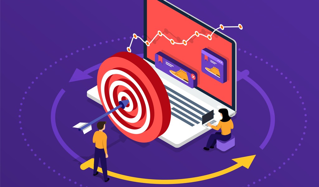
3. Give Visitors a Powerful Call to Action
Every landing page should have a single purpose. Your call to action tells people what to do and how to accomplish it in as clear terms and few steps as possible. Put your CTA and buttons front-and-center, that way there's no room for doubt in the visitor’s mind. According to Hubspot, visual clutter, such as complex graphics, detracts from the message.
If you’re tempted to add more than one CTA per page, give the other ideas their own landing page.
4. Make Buttons Visually Pop Against the Background
All roads should lead to the call to action and what you want visitors to click. Do you want visitors to fill out a form or do you want them to press “Click Here!” to learn more? Improve the odds of them doing so by making those page elements pop against the background. Use bold fonts, vibrant colors, or both. Include relevant keywords that are actions words. Kissmetrics recommends adding “free,” “buy,” or “download now” to align with the most effective keywords.

5. Use a Little Color Theory
Think about how these colors affect visitor perception and align with the purpose of your business:
| Color | Effect |
| Attention-getting, youthful, upbeat, energetic | |
| Punchy, assertive, get attention in a hurry | |
| Energetic, sense of urgency, great for sale items | |
| Sweet, feminine, romantic | |
| Trust, security | |
| Calm, serenity | |
| Wealth, money | |
| Classic, luxury |
To get the most out of your color choices, make text and buttons contrast against the background. For example, if you want the most mileage from a red button or call to action text, layer it over a background that’s white, gray, or complementary (contrasting or opposite) on the color wheel. Here are a few complementary color examples:
- Red and Green
- Blue and Orange
- Purple and Yellow
- Pink and Bright Green
6. Retargeting to Bring Them Back
Even if you have the most exciting landing page offer in the world, some people just aren't ready to buy. You can recapture these missed opportunities by adding a retargeting pixel to your landing page or related service pages. This will allow you to create ads specifically targeted at users who visited your page, but didn't pull the trigger.
Retargeted ads work best when they include discounts or content related to your landing page offer. And they cost significantly less than traditional PPC ads. "Remarketing allowed us to increase our repeat visitors by 50%, boost conversion by 51%, and increase time on site by 300%!" - Larry Kim via Wordstream.
Conclusion: Keep Testing and Evolving
Testing is a key element to create a visually streamlined, simple landing page that gets the results you need. The goal of every landing page is always the same - encourage visitors to take some specific type of action. How you get visitors to take action is what sets your business apart.
At the end of the day, there are a million different combinations of colors, headlines, images, and offers that can help your business build an effective landing page. The one most crucial piece of advice is to never stop testing, because what works today might not work tomorrow!
If you don't know where to start, schedule a website strategy assessment with our team and let us know which landing pages you need help with. We'll provide custom suggestions on how your lead conversion pathways could be improved.